How to Add Animations to Your Website (Without Code)
By Sam Codes · · 7 min read
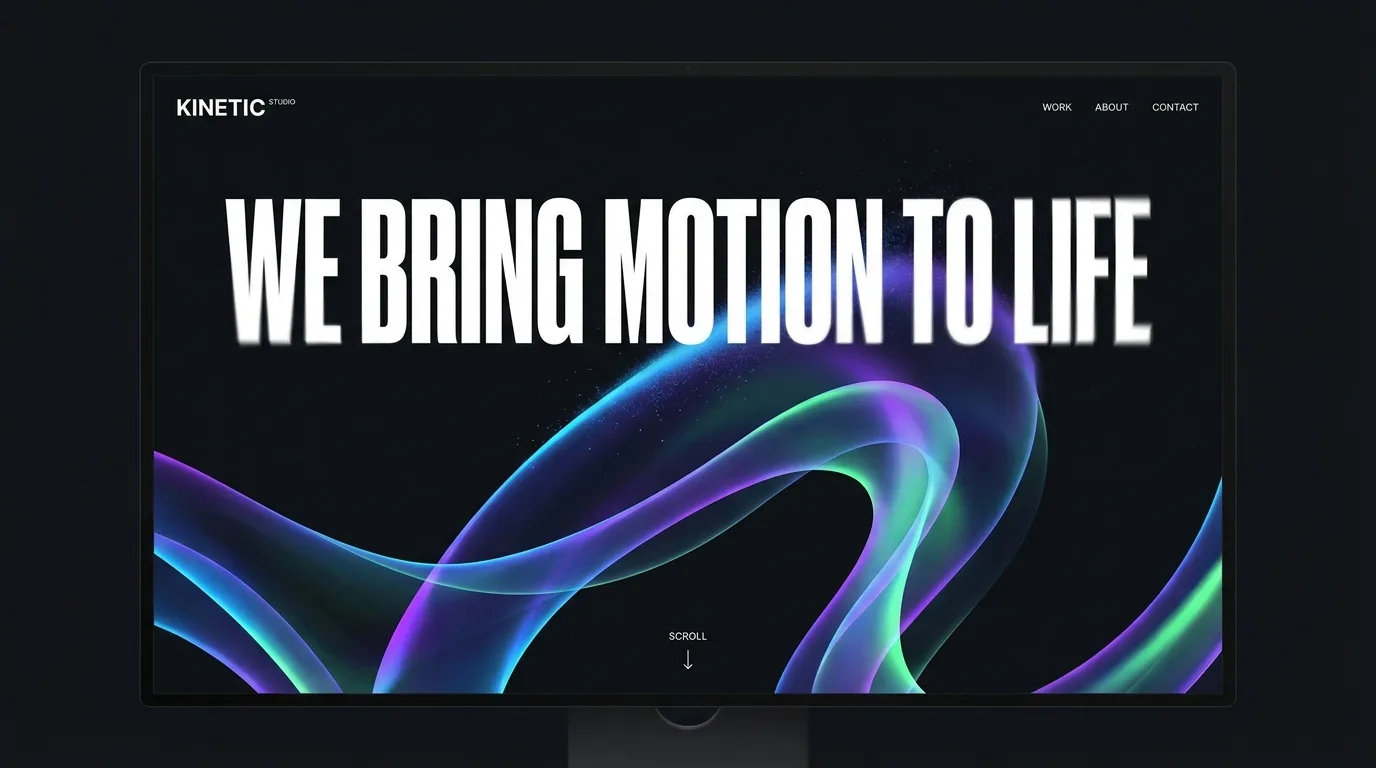
Motion is one of the fastest ways to make a website feel modern and alive. It is also one of the fastest ways to make it feel cheap. Done well, animation guides the eye, rewards scrolling, and makes a site feel considered. Done badly, it distracts, slows the page down, and gives people motion sickness.
This guide covers the animations that are actually worth adding, where to use them and where not to, how to keep your site fast, and how to get all of it without touching code.
What good website animation actually does
The best website animation is almost invisible: you feel it more than you notice it. Its job is to guide attention and give feedback, not to show off. A section that gently fades up as you scroll to it says "this is new, look here." A button that shifts slightly when you hover says "this is clickable." That is the whole point, motion with a reason.
If an animation does not help the visitor understand or use the page, it is decoration. And decoration is the first thing that starts to feel dated.
- Guide the eye to what matters as the visitor scrolls
- Give feedback on what is interactive (hovers, clicks, form states)
- Add a sense of polish and intentional pacing
- Set a mood, calm and slow or energetic and snappy, that matches your brand
The animations worth adding
You only need a handful of animation types to cover almost every site. These are the ones that earn their place.
Scroll reveals
Sections and images that fade or slide into view as they enter the screen. This is the workhorse of modern web design, it turns a long page into a sequence of moments instead of a wall of content. Keep the movement small (a short fade-up of 20 to 30 pixels) and quick.
Hover micro-interactions
Small responses when someone hovers a button, card, or link: a subtle lift, a color shift, an underline that draws in. They make a site feel responsive and quietly tell people what they can click.
A single hero moment
One deliberate animation when the page loads, a headline that settles into place, a background that drifts slowly. One is enough. A hero that keeps moving competes with your message instead of delivering it.
Apple-style scroll animations
A product that turns, opens or comes apart as you scroll, the effect Apple uses on its product pages. It is a short video cut into still frames that the scroll bar plays forward and back. Our free video to scroll animation tool turns any clip into those frames in your browser and gives you the code. Keep it to one per page, on the thing you most want people to look at.
Parallax and depth
Backgrounds or layers that move at a different speed than the foreground as you scroll, adding a sense of depth. Powerful in small doses, nauseating in large ones. Use it once, near the top, not on every section.
Where to use motion, and where to leave it alone
The instinct once you can animate is to animate everything. Resist it. The most sophisticated sites are restrained, motion is a seasoning, not the meal.
Animate to introduce a section, reward a scroll, or confirm an action. Do not animate body text people are trying to read, do not loop motion in the corner of the eye, and never make someone wait for an animation to finish before they can act.
- Good: a section fading up as it enters view
- Good: a hover state on buttons and cards
- Good: one calm hero animation on load
- Avoid: text that flies in letter by letter on every paragraph
- Avoid: looping motion that never stops in the periphery
- Avoid: anything that blocks the visitor from clicking or scrolling
Keep it fast and accessible
Two things quietly ruin animated sites: performance and accessibility. Heavy animation can make a page stutter, especially on phones, and phones are where most people will see it. Stick to effects browsers handle smoothly (fades and simple movement) and avoid animating big images or dozens of elements at once.
Accessibility matters too. Some people get motion sick or find movement distracting, and their browser lets them ask for less of it. A well-built site respects that "reduce motion" setting and dials the effects back automatically. If your tool handles this for you, you get it for free.
- Prefer fades and small movements, they stay smooth even on older phones
- Do not animate large images or many elements at the same time
- Respect the visitor's "reduce motion" browser setting
- Test on a real phone, not just your laptop
How to add animations without writing code
You do not need JavaScript or a motion library for any of this. The old way was to hand-code animations or wrestle with a plugin. The faster way is to describe the effect you want and let the tool build it: "fade each section in as it scrolls into view," "add a subtle hover lift to the cards," "give the hero a slow drift."
The advantage of describing it is that you can iterate in plain language. Too much, too fast, wrong section? Just say so and adjust.
How Looops adds motion for you
Looops is an AI website builder you drive by chatting. Every site it builds comes with tasteful motion already in place, scroll reveals, hover states, and a considered hero, tuned to your design rather than bolted on. You refine it by talking: "make the animations snappier," "add a parallax background to the hero," "calm the motion down on the pricing section."
It also handles the parts people forget: the animations stay smooth on mobile and automatically respect a visitor's reduce-motion setting, so your site feels alive without feeling broken.
- Motion built in from the first version, not an afterthought
- Refine any effect by describing it in plain English
- Scroll reveals, hover states, and a hero animation on every build
- Smooth on mobile and respectful of reduce-motion settings
- No code, no plugins, no motion library to learn
Build a site that moves
Describe what you want and Looops builds it, tasteful motion included. Free to start.
Free plan available, no card required
Frequently Asked
Questions.
Keep reading
Ready to build your website?
Describe what you want and Looops builds it. Free to start, no card required.
Start building free