15 Restaurant Website Examples Worth Copying (2026)
By Sam Codes · · 9 min read
A great restaurant website does one thing above everything else: it removes the friction between a hungry person and a reservation or an order. The best ones load fast on mobile, answer the four questions every visitor has (what kind of food, where, when, how much), and make it effortless to take the next step.
Instead of pointing you at competitor screenshots you can't replicate, this guide breaks down the 15 design patterns that appear on the highest-converting restaurant sites. For each one: why it works, and the concrete steps to steal it.
What makes a great restaurant website
Visitors arrive from Google, Instagram, or a friend's recommendation. They are deciding whether to book. They need answers fast: what is this place, where is it, can I get in tonight, and does the food look worth it. Every element of your site should serve that decision.
The patterns below are ordered from most critical (the first thing visitors see) to supporting details that build confidence and repeat visits.
The 15 design patterns worth stealing
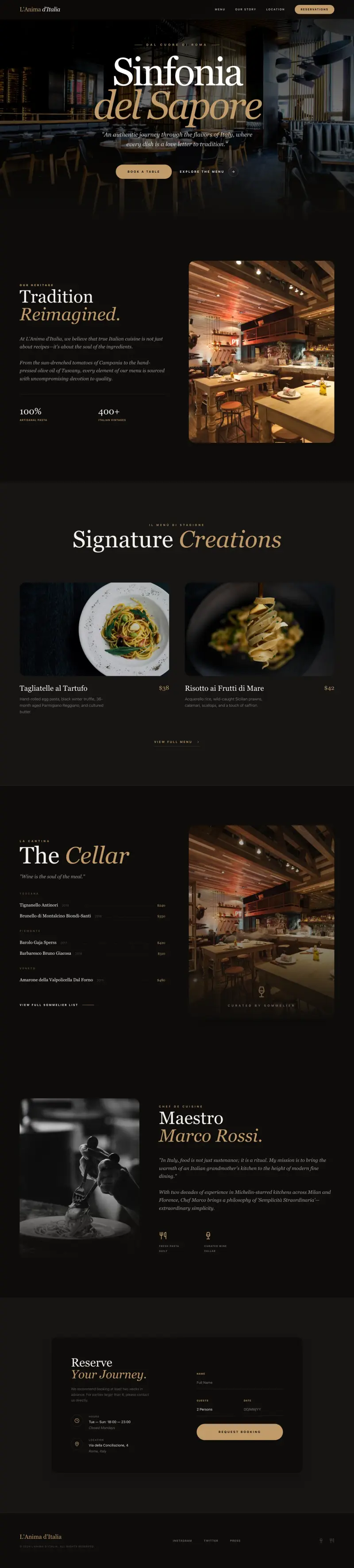
1. A hero with a mouth-watering photo and a single CTA button
The hero is the first thing a visitor sees. The strongest restaurant heroes pair one full-width food or atmosphere photo with a single, high-contrast button ("Reserve a Table" or "Order Online"). No carousels, no paragraph of text, no list of links.
It works because it mirrors the way someone decides in real life: they see the food, they feel an urge, they act. The moment you add a second button or a wall of text, you split that attention and the urge fades.
- Steal this: use a professional photo of your most photogenic dish or your dining room at golden hour. Shoot horizontal, leave the left third clear for text overlay.
- Steal this: write the button label as an action, not a noun. "Book a Table" converts better than "Reservations".
- Steal this: keep the hero copy to one headline (your restaurant name or a short tagline) and one subhead (cuisine type and neighbourhood). Nothing else.
2. Hours and location above the fold on mobile
More than half of restaurant site visits happen on a phone while someone is deciding whether to visit right now. If they have to scroll to find your address or hours, many won't bother.
Dedicated hours and location text (or a compact map pin) in the sticky header or directly below the hero is the single highest-ROI usability change most restaurant sites could make.
- Steal this: put opening hours as plain text, not in a footer accordion. "Tue-Sun, 12pm-10pm" takes 30 characters and saves hundreds of Google searches.
- Steal this: link your address to Google Maps so a tap opens navigation immediately.
- Steal this: if you're closed Mondays, say so explicitly. Visitors who arrive on Monday need to know, not guess.
3. A sticky header that survives scrolling
As visitors scroll through photos, the menu, and the about section, the key actions (reservation, phone number) should stay within one tap at all times. A sticky header with your logo, a phone number, and one CTA button achieves this without feeling cluttered.
This pattern is especially important on long one-pager layouts common on mobile, where scrolling back to the top costs attention.
- Steal this: keep the sticky header to three elements: logo, phone number (tappable on mobile), and one action button.
- Steal this: give the header a semi-transparent background so it doesn't obscure content but still reads clearly.
- Steal this: on mobile, collapse the menu items into a hamburger, but never hide the phone number and CTA button.
4. An online menu that doesn't require a PDF download
PDFs are invisible to Google, impossible to read on a phone without pinching, and can't be updated without re-exporting and re-uploading. A web-based menu, even a simple one, is faster to load, easier to navigate, and indexable by search engines.
This matters for SEO too: someone searching "burger restaurants open near me" can land directly on your menu page if it's properly structured.
- Steal this: organise your menu into sections (Starters, Mains, Desserts, Drinks) using clear headings so visitors can jump straight to what they want.
- Steal this: include a short description and price for each item. No description and no price are the two most common reasons someone abandons a restaurant site.
- Steal this: mark dietary options (vegetarian, gluten-free) with a simple icon rather than a long footnote.
5. A photo gallery that shows the actual experience
Stock photos are instantly detectable and actively damaging to trust. A gallery of real photos, even taken on a modern phone, performs better. Visitors want to know what the lighting is like, how big the tables are, and whether it matches the occasion they have in mind.
The strongest galleries mix food close-ups, table settings, the bar area, and candid shots of the space at service. Variety answers more of the decision-making questions than a grid of identical dish photos.
- Steal this: a 6-8 image masonry or grid layout above the fold on the About or Gallery page gives a fast, rich impression without a heavy slideshow.
- Steal this: caption each photo with the dish name or the area of the restaurant. It adds context and makes the images indexable.
- Steal this: update the gallery seasonally. Stale photos from three years ago telegraph neglect.
6. An online reservation or booking integration
Most people who want to book a table will not pick up the phone to do it. A direct booking widget, or a clearly labeled link to your reservation platform (OpenTable, Resy, Tock, or a direct form), captures intent at the exact moment it's highest.
The key is that the booking option is never more than one tap away. Burying a reservation link in the footer or contact page loses the booking.
- Steal this: embed your booking widget or a date/time selector directly on the homepage, not just on a separate Reservations page.
- Steal this: if you use a third-party platform, pass UTM parameters so you can track how many reservations originate from your website.
- Steal this: for walk-in restaurants, replace the reservation CTA with a "Check wait times" link or "See tonight's specials" to give the button a job.
7. An online ordering link (for delivery or takeaway)
If you offer delivery or takeaway, the ordering link should be just as prominent as the reservation button. Visitors searching for "[restaurant name] order online" expect to land on a page that lets them do exactly that without a detour.
Even if you use a third-party platform like Uber Eats, having a dedicated "Order Online" button on your site gives you a trackable entry point and looks more intentional.
- Steal this: use two buttons in the hero, "Book a Table" and "Order Online", if both apply. Keep them the same size so neither dominates.
- Steal this: if you have a direct ordering system, lead with that. Third-party platforms take a commission on every order; directing traffic to your own system first is worth the friction of explaining it.
- Steal this: add a short note next to the order link about minimum order amount or delivery radius so visitors aren't surprised mid-checkout.
8. Customer reviews and social proof on the page
Restaurant decisions are high-trust. Before a first visit, most people check reviews. Displaying a handful of real reviews directly on your site keeps that trust-building on your page, rather than sending visitors to Google or Yelp where they can get distracted by competitors.
Three to five specific, genuine reviews with star ratings and (where possible) reviewer names work far better than a generic "our customers love us" paragraph.
- Steal this: pull two or three of your best Google reviews and display them as pull-quotes with the reviewer's first name and rating. Include a link to your full Google listing for verification.
- Steal this: choose reviews that mention a specific dish or occasion ("the tiramisu was the best I've had in years", "perfect for a birthday dinner"). Specifics are more persuasive than generics.
- Steal this: if you have a consistent 4.5+ rating on a platform, displaying the aggregate score ("4.8 on Google, 200+ reviews") above the fold builds instant credibility.
9. A specials or events section that shows the place is alive
A restaurant site with static content and a copyright year of 2021 in the footer looks abandoned. A small, easy-to-update section for weekly specials, seasonal menus, or upcoming events signals that the business is active and gives returning visitors a reason to check back.
This doesn't need to be elaborate. A simple "This week's special" tile or a "Upcoming events" list with three items is enough to do the job.
- Steal this: a dedicated "Specials" section on the homepage, updated weekly, pulls well from Google's freshness signals and gives you low-effort social content at the same time.
- Steal this: for events (live music, wine tastings, prix fixe nights), include a date, a brief description, and a link to book or RSVP. Without those three things, the listing does nothing.
- Steal this: connect your specials section to a simple CMS so a staff member can update it without touching code or calling a developer.
10. A mobile-first one-pager layout for smaller venues
Not every restaurant needs a multi-page site. For cafes, food trucks, pop-ups, and small neighbourhood spots, a single well-structured page with clear sections (hero, menu, about, hours/location, contact) often converts better than a scattered multi-page site. There's less to maintain, faster to load, and easier to navigate on a phone.
The one-pager pattern works because it removes the navigation decisions. The visitor scrolls through a curated story rather than having to choose which page to visit.
- Steal this: use anchor links in the header (Menu, About, Find Us) so visitors can jump to the section they want without feeling lost on a long page.
- Steal this: end the page with a full-width map, your phone number, and your social links. This mirrors how someone naturally closes a venue check: confirm the location, then decide.
- Steal this: a one-pager is the easiest format to describe to an AI builder and get right on the first pass.
11. An "Our Story" section that creates connection
People root for businesses with a story. A short, honest paragraph about how the restaurant came to be, who's behind it, and what drives the kitchen builds the kind of connection that turns a first-time visitor into a regular.
The story doesn't need to be cinematic. "This started as a Sunday dinner tradition we wanted to share with the neighbourhood" is more compelling than a paragraph of awards and accolades.
- Steal this: include a photo of the owners or head chef alongside the story. Faces build trust faster than words alone.
- Steal this: keep it to two short paragraphs. A wall of text about your history will not be read; a tight, warm paragraph will be.
- Steal this: end the about section with a transition line that leads to the next action. "Come see for yourself" with a reservation link is a natural close.
12. A contact section with every channel clearly listed
It sounds obvious, but a surprising number of restaurant sites make visitors work to find a phone number or email address. A contact section should list: phone number (tappable), email, address with a map link, and parking/transit notes if relevant.
Private dining or catering enquiries deserve their own call out here, since those are high-value bookings that get lost if the only contact path is a generic form.
- Steal this: a "Contact & Find Us" section at the bottom of every page (not just the contact page) means visitors never have to navigate away from where they are to get in touch.
- Steal this: if you take private bookings for events or group dining, add a separate email address or form just for that purpose. It signals you handle it seriously.
- Steal this: mention your Google Business Profile in the contact section. "Find us on Google Maps" links to your verified listing and helps local search ranking.
13. Social media links that link to active accounts
Social links on a restaurant site are social proof: they imply an active, engaged business. But they only work if the linked accounts are actually active. A link to an Instagram account with three posts from 2023 is worse than no link at all.
If you post food photos and stories regularly, prominently linking your Instagram can extend the time a potential visitor spends with your brand before booking.
- Steal this: if Instagram is your strongest channel, embed a small feed preview on your site. Even a static grid of your last 4-6 posts, refreshed manually, adds visual richness.
- Steal this: use the social links section to signal what kind of content you post. "Follow for daily specials and behind-the-scenes" tells visitors what they get before they click.
- Steal this: if you're not active on a platform, don't link to it. A dead Facebook page is a negative trust signal.
14. A gift card or voucher page for occasion-driven customers
Restaurant gift cards are purchased by people who've already decided your venue is good enough to gift. A dedicated, easy-to-find gift card page captures this high-intent purchase at the moment it's most likely to happen: around holidays, anniversaries, and birthdays.
The pattern is often ignored because operators think gift cards are a point-of-sale product. But a "Give the gift of a great meal" page on your site can do real revenue work year-round.
- Steal this: add a "Gift Cards" link to your main navigation. The people who want gift cards are looking for it; don't make them hunt.
- Steal this: frame it around the occasion, not the transaction. "Perfect for birthdays, anniversaries, and thank-yous" is more compelling than "Buy a gift card here".
- Steal this: link from your About section and from your confirmation emails to the gift card page to keep it visible year-round.
15. An SEO-structured page with your location in the title
A restaurant that shows up when someone searches "Italian restaurant Shoreditch" or "best tacos Brooklyn" has a structural advantage that no amount of social media can replicate. That ranking starts with a few simple on-page choices: your city or neighbourhood in the page title, your full address on the page, and distinct page titles for each key page (home, menu, contact).
This is the pattern most often overlooked by restaurants that use a basic website template, because templates rarely populate location into the title automatically.
- Steal this: your homepage title should be "[Restaurant Name] - [Cuisine Type] in [Neighbourhood or City]", not just your restaurant name.
- Steal this: include your full address as plain text on the page (not just embedded in a map widget) so Google can read it easily.
- Steal this: create a separate page for "Menus" with a unique title tag. Pages with dedicated titles rank for different query types than a homepage.
How to build your restaurant site with Looops
Describe your restaurant to the AI and it builds the full site: hero, menu section, about, hours, contact, and a booking link. You can include as much detail as you like in your description ("warm Italian trattoria, 40 covers, open Tuesday to Sunday, specialising in handmade pasta") and refine any section by clicking it and typing what to change.
The built-in CMS means your menu and specials section can be updated by anyone on your team without touching code. One-click publish puts it live, with fast hosting and a secure connection already handled. When you're ready for your own domain, connect it in the settings and it updates in minutes.
For the patterns above that require a third-party integration (reservation widgets, ordering platforms), Looops lets you embed external scripts so OpenTable, Resy, or any booking tool works inside your site. You don't need a developer to do this.
Build your restaurant site today
Describe your restaurant and Looops builds the full site. Free to start, live in minutes.
Free plan available, no card required
Frequently Asked
Questions.
Keep reading
Ready to build your website?
Describe what you want and Looops builds it. Free to start, no card required.
Start building free