15 Small Business Website Examples for Inspiration (2026)
By Sam Codes · · 9 min read
The best small business websites share one quality: they convert visitors into customers without friction. They answer the right questions fast, build trust with real proof, and make the next step obvious. They work across every niche, from a one-person coaching practice to a trades business with a team of ten.
Instead of pointing at screenshots you can't replicate, this guide breaks down the 15 design patterns that appear on the highest-performing small business websites in 2026. Each one includes why it works and the exact moves to apply it to your own site.
What separates a high-converting small business site
Visitors arrive with a question: "Can this business solve my problem?" Everything on your site is either answering that question or distracting from it. The patterns below are organised from the most critical (what visitors see first) through to the supporting layers that build confidence and remove objections.
Most of these patterns apply across niches. A few are particularly strong for specific business types; those are noted inline.
The 15 design patterns worth stealing
1. A value proposition above the fold that answers 'what and for whom'
The most common mistake on small business sites is leading with the business name and nothing else. Visitors don't yet know whether you're relevant to them. A clear, specific value proposition in the hero, "Bookkeeping for UK freelancers, done in a day" or "Family dentist in East Austin, taking new patients" does the orienting work in seconds.
This pattern is the single highest-impact change on most small business sites because it reduces bounce rate before any other element has a chance to do its job.
- Steal this: write your headline as [what you do] + [for whom] + [the outcome or differentiator]. Keep it under 12 words.
- Steal this: test your headline by reading it aloud to someone unfamiliar with your business. If they can't tell you what you do and who you serve, rewrite it.
- Steal this: put this headline in the largest text on the page. Don't let your logo or a tagline compete with it for visual weight.
2. One strong call to action, not five
Sites with five or six CTAs, "Book Now", "Learn More", "See Pricing", "Download Guide", "Follow Us", "Subscribe", consistently convert worse than sites with one primary action. More choices produce fewer decisions. The strongest small business sites pick one primary action per page and make it impossible to miss.
For service businesses the primary action is almost always "Book a Call" or "Get a Quote". For product businesses it's "Shop Now" or "Order Today". For local businesses it's often "Call Us" or "Book an Appointment".
- Steal this: choose one primary CTA for your homepage and repeat it: in the hero, in the mid-page section, and in the footer. Consistency outperforms variety.
- Steal this: use a high-contrast button color that doesn't appear anywhere else on the page. The CTA button should stand out visually from every other element.
- Steal this: write the button label as a specific action, not a vague one. "Book a Free 20-Minute Call" converts better than "Get in Touch".
3. Social proof placed before the pitch, not after
Most small business sites put testimonials at the bottom of the page, below the services, pricing, and about sections. That's too late. Visitors who aren't yet convinced by the top of your page won't scroll to the bottom to read reviews.
The highest-performing pattern places a review pull-quote, a client logo strip, or a star rating directly below the hero, before the first description of your services. Proof comes first; then the visitor is ready to hear the pitch.
- Steal this: place one strong, specific testimonial (not a generic one) directly below your hero. The reviewer's name, company, and ideally a photo make it feel real.
- Steal this: if you have a consistent Google or Trustpilot rating, display the aggregate score near the top of the page. "4.9 on Google, 80+ reviews" in the hero subtext is powerful social proof with zero extra space.
- Steal this: for B2B businesses, a row of past client logos (even four or five) outperforms a written testimonial for cold visitors. It triggers recognition even if they don't know the brands.
4. Services or products described in outcome language
Service businesses often describe what they do in process terms: "We provide comprehensive bookkeeping services including reconciliation, reporting, and payroll." Customers care about what they get, not the process. Outcome language translates the same offering: "Always know your numbers. We handle the bookkeeping so you can focus on the work."
This pattern matters most for trades, professional services, coaches, and consultants, where the actual service is invisible and the buyer is paying for a result.
- Steal this: for each service you offer, write the outcome first ("Your accounts are always up to date"), then the process ("We reconcile your books weekly and send a summary every month").
- Steal this: use "you" language, not "we" language. "You get a monthly report" is more compelling than "We provide monthly reports".
- Steal this: include one specific detail per service that proves you're thorough. "Including VAT returns" or "same-day turnaround" does more work than a general claim of quality.
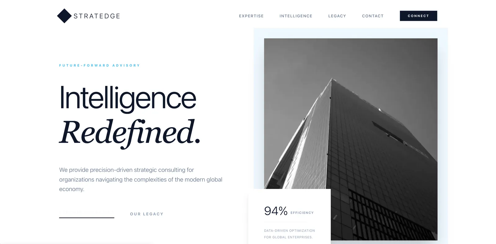
5. A photo of the real person or team behind the business
For small businesses, especially sole traders, coaches, consultants, therapists, and personal trainers, the person is the product. A site with no photos of the human behind the business is asking visitors to trust an unknown entity. A good portrait photo, even one taken on a phone in good light, is worth more than any amount of carefully chosen stock imagery.
This pattern applies to most small businesses but is especially critical for any service where the customer is buying a relationship, not just a transaction.
- Steal this: use a natural, approachable photo rather than a formal headshot. A photo of you at work (in the salon, at the workbench, on a coaching call) shows competence and personality at the same time.
- Steal this: pair the photo with a short first-person line that explains your 'why'. "I started this because I was tired of clients getting ripped off by bigger firms" creates an instant connection.
- Steal this: if you have a team, show the team. A group photo next to your values section humanises the business at scale.
6. Simple navigation with five items or fewer
Navigation menus with eight or ten items create a paradox of choice that sends visitors back to Google. The clearest small business sites have five items or fewer: Home, Services, About, Testimonials (or Work), and Contact. Anything else goes in the footer or a secondary menu.
Simple navigation also forces you to organise your site around what visitors actually care about, not what's convenient to maintain.
- Steal this: audit your current navigation and remove any item that isn't one of the top three things visitors come to your site for. If you have a blog, it belongs in the footer, not the main nav.
- Steal this: give your navigation items plain, descriptive labels. "Work With Me" is clear; "Collaborations" is not. "Prices" is clear; "Investment" is jargon.
- Steal this: end your navigation with a CTA link or button. "Book a Call" or "Get a Quote" at the far right of the nav is always visible and carries no cost.
7. A mobile-first layout that works on a phone without pinching
Over 60% of web traffic to local small business sites arrives on a phone. If your site requires pinching, zooming, or horizontal scrolling to read on a small screen, you are losing more than half your potential customers before they've read a word.
Mobile-first means designing for a single column, large tap targets, text that's readable without zooming, and no hover-dependent interactions. Everything else is an enhancement for larger screens.
- Steal this: check your site on your own phone before publishing anything. Scroll through every page, tap every button. If anything feels awkward, fix it.
- Steal this: your phone number should be a tappable link (tel: protocol) on mobile. Visitors who want to call you shouldn't have to memorise a number.
- Steal this: keep forms short on mobile. A contact form with first name, email, and one message field converts better on a phone than an eight-field intake form.
8. A booking or enquiry form that actually gets responses
The difference between a booking form that gets ignored and one that books clients is often just a single question: "What are you hoping to achieve?" or "When would you like to come in?" Adding one qualifying question to a basic contact form turns a general enquiry into a pre-qualified lead and makes your response feel personalised rather than automated.
This pattern is especially valuable for coaches, consultants, photographers, personal trainers, and trades businesses where scope varies by client.
- Steal this: add a single qualifying question to your contact form. "What brings you here?" with two or three radio options (website, social media, referral, other) takes five seconds to fill out and gives you immediately useful information.
- Steal this: set a clear response time expectation on the form page. "We reply within one business day" reduces anxiety and increases form completions.
- Steal this: redirect to a thank-you page after submission rather than showing an in-page message. A thank-you page can include a next step ("While you wait, here's what to expect") and can be tracked as a conversion in analytics.
9. Local trust signals for businesses that serve a geography
For any business that serves customers in a specific city or region, local trust signals matter as much as general credibility. Local signals include your town or neighbourhood in the hero text, a testimonial from a recognisable local person or business, a map embed, and mentions of local landmarks or areas you serve.
These signals reassure visitors that you are genuinely local, not a national service pretending to be local, and they directly help local search ranking.
- Steal this: include your city or neighbourhood in your homepage headline or directly below it. "The go-to plumber for South Leeds" outranks and outconverts "Quality plumbing services".
- Steal this: list the specific areas you serve ("Covering Leeds, Bradford, Wakefield, and Harrogate") as plain text on your contact page. This language helps Google serve you for searches from those areas.
- Steal this: embed a Google Map and make sure your Google Business Profile matches the address on your site exactly. Discrepancies hurt local ranking.
10. Clear pricing (or an honest reason why you can't show it)
"Price on request" is a common pattern on small business sites, and it is often the single biggest source of lost enquiries. Visitors who can't see a price either assume it's too expensive, move to a competitor who does show pricing, or submit an enquiry that wastes everyone's time because the budget was never aligned.
If your pricing genuinely varies by project, a "Starting from" rate or a price range does the filtering work without revealing every detail.
- Steal this: if you have fixed prices, show them. A simple pricing section with two or three tiers outperforms a "contact for pricing" page for most service businesses.
- Steal this: if pricing varies, show a starting price or a range. "Projects from $1,500" tells visitors whether they're in the right ballpark without locking you into a fixed quote.
- Steal this: if you genuinely can't show pricing, add a line that explains why and sets a clear expectation. "Every project is quoted individually; most clients budget $X-Y for this scope" removes the uncertainty.
11. A portfolio or 'work' section for visual and service businesses
For photographers, designers, builders, landscapers, interior decorators, and anyone whose output is visible, a portfolio section is the most persuasive part of the site. Before-and-after pairs, project highlights, and captioned case studies show rather than tell.
The most effective portfolio sections include a short description of each project: what the client needed, what you did, and the result. This context transforms a gallery into a proof statement.
- Steal this: organise portfolio items by the type of client or project (residential, commercial, editorial, weddings) so visitors can find examples relevant to their own needs.
- Steal this: include three or four "case studies" with a short problem-solution-result format. These rank well in search and are particularly persuasive for high-value projects.
- Steal this: update your portfolio regularly. A portfolio with all work from two or three years ago suggests you haven't had recent clients, even if that's not true.
12. An FAQ section that handles the real objections
The questions that appear in your FAQ should be the actual questions you hear from enquiries, not the questions you wish people would ask. An FAQ that addresses pricing uncertainty, turnaround time, what happens if something goes wrong, and how the process works handles objections before they become reasons not to book.
FAQ content also has strong SEO and AI citation value: it matches the conversational query patterns that people type into search engines and voice assistants.
- Steal this: write down the five questions every new enquiry asks you. Those are your FAQ entries. Not a generic "How long have you been in business?" but the real hesitations: "Do you work with small budgets?", "How long will it take?", "What if I'm not happy with the result?"
- Steal this: use plain, conversational phrasing in both the questions and answers. Mirror the exact language your customers use, not the language you use internally.
- Steal this: add a link to your booking or contact form at the end of the FAQ. Visitors who've just read through your answers are primed to take action.
13. A blog or resource section for businesses targeting search
Not every small business needs a blog. But for any business where customers do research before buying (coaches, consultants, accountants, solicitors, specialist trades), a small collection of genuinely useful articles is one of the most cost-effective ways to be found.
The key word is "genuinely useful". One well-researched 1,500-word article that answers a real question your customers have will outrank ten thin, keyword-stuffed posts every time in 2026.
- Steal this: write about the questions your customers actually ask, not about your business. "How much does a kitchen renovation cost in 2026?" gets searched; "Why we're the best kitchen fitters" does not.
- Steal this: interlink your articles to your service pages. A reader who finds your "how much does X cost" article and then clicks through to your pricing page is a warm lead.
- Steal this: you don't need to publish often. Four to six strong articles per year beats a weekly post that's too thin to rank.
14. A clear next step at the end of every page
Visitors who reach the bottom of a page have read more than average. That attention shouldn't end with a footer and a copyright notice. Every page should close with a clear next step: a CTA, a link to related content, or at minimum a contact section with your phone number visible.
The pattern works because it captures visitors at the moment they've consumed the most information and are most likely to act. Ending a page with nothing is the equivalent of a sales conversation that just trails off.
- Steal this: add a simple CTA section at the bottom of every service page. It doesn't need to be elaborate: a heading, two sentences, and a button.
- Steal this: on blog or resource pages, end with a section linking to two or three related articles. It keeps visitors engaged and builds the internal linking structure that helps search ranking.
- Steal this: make your footer do more work. At minimum it should include your phone number, email, address, and primary CTA. Most visitors who scroll to a footer are looking for contact details.
15. Fast loading speed, especially on mobile connections
Page speed is both a ranking factor and a conversion factor. A site that takes more than three seconds to load on a mobile connection loses a large share of its visitors before they've seen a single word. The main culprits for slow small business sites are uncompressed images, too many third-party scripts, and cheap shared hosting.
This pattern requires no design skill, only discipline: compress images before uploading, avoid adding analytics or chat widgets you don't actively use, and choose a hosting platform that serves files from a CDN.
- Steal this: run your site through Google PageSpeed Insights (free tool). Anything below 70 on mobile has room for easy wins.
- Steal this: compress every image before uploading it. Most phones produce photos that are 4-6MB; a compressed version for the web should be under 200KB without visible quality loss.
- Steal this: choose a website builder that handles hosting on a global CDN by default. This is one area where a purpose-built platform saves you significant ongoing work versus self-managed hosting.
How to build your small business site with Looops
Describe your business to the AI and it builds a complete site: a value-proposition hero, services section, about, contact form, and any niche-specific sections (portfolio, testimonials, pricing). The more specific your description, the closer the first draft is to what you need. "A personal training studio in Manchester for women over 40, focused on strength and confidence, taking new clients via a discovery call" gives the AI everything it needs to make something real.
You refine by clicking any element and telling the AI what to change. No menus to learn, no blocks to drag. Every change is checkpointed so you can undo freely. The built-in CMS handles any content that needs updating over time, and one-click publish puts you live with fast, secure hosting and your custom domain.
The patterns in this guide are the same ones Looops uses as starting points when it builds sites for specific niches. You can describe the pattern you want directly, "add a FAQ section with my top five questions" or "add a portfolio grid with before-and-after pairs", and the AI builds it in seconds.
Build your small business site today
Describe your business and Looops builds the full site. Free to start, live in minutes.
Free plan available, no card required
Frequently Asked
Questions.
Keep reading
Ready to build your website?
Describe what you want and Looops builds it. Free to start, no card required.
Start building free